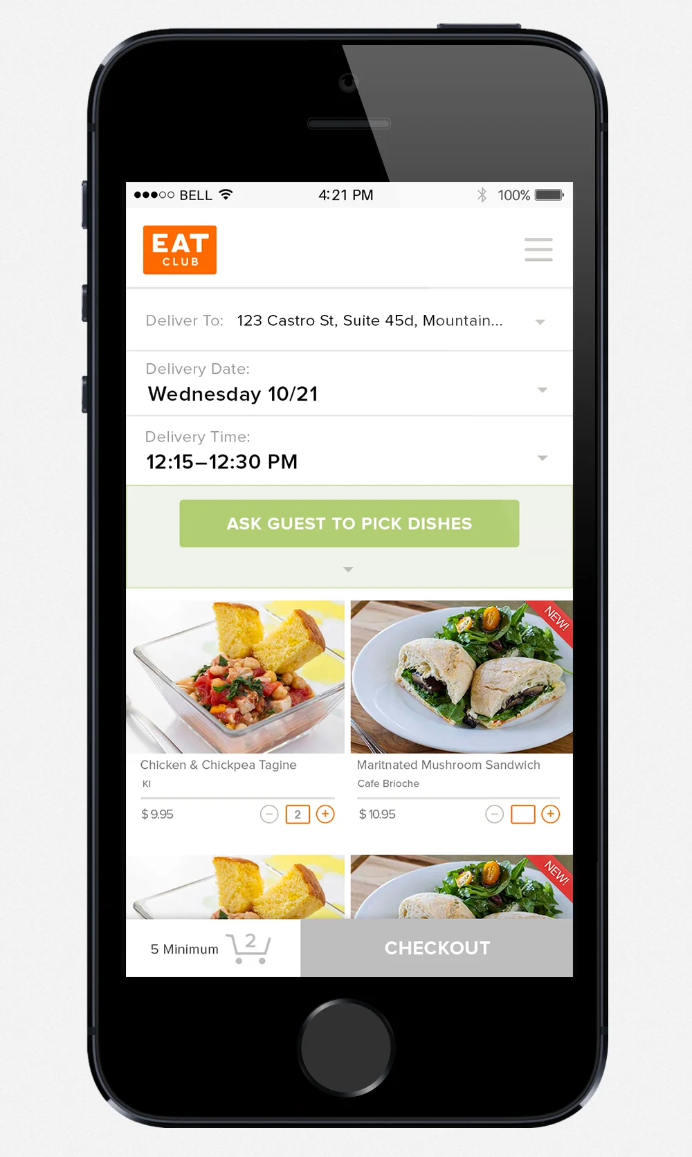
In 2014, I worked on EAT Club rebranding project with the art director. From choosing the brand color, fonts to creating the graphic elements and complete to look and feel from the 2D (websites, mobile UI, promotional banners, presentation deck) to print and packaging.

Branding (2014)
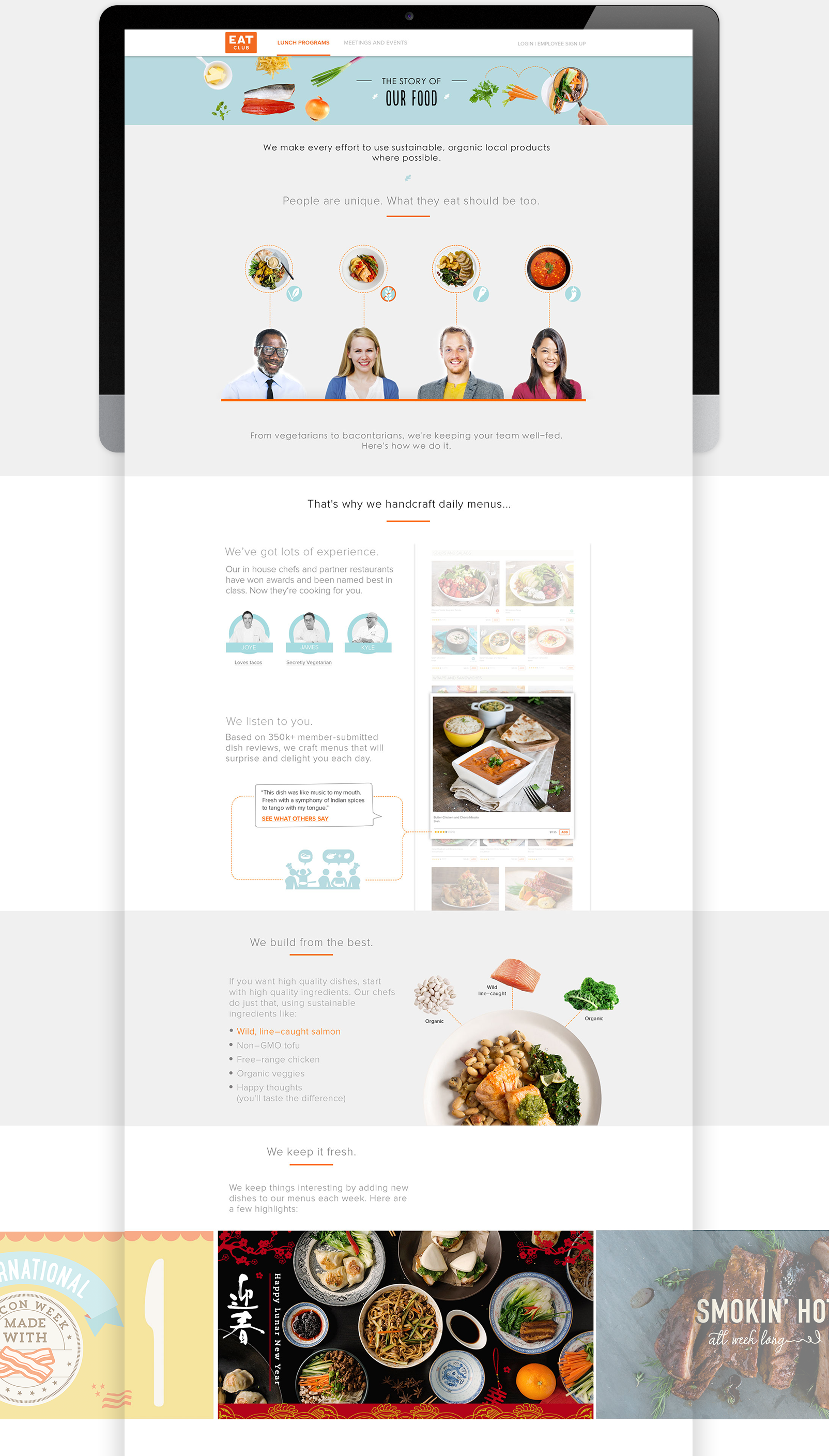
EXTERNAL PAGES & INTERNAL PAGES
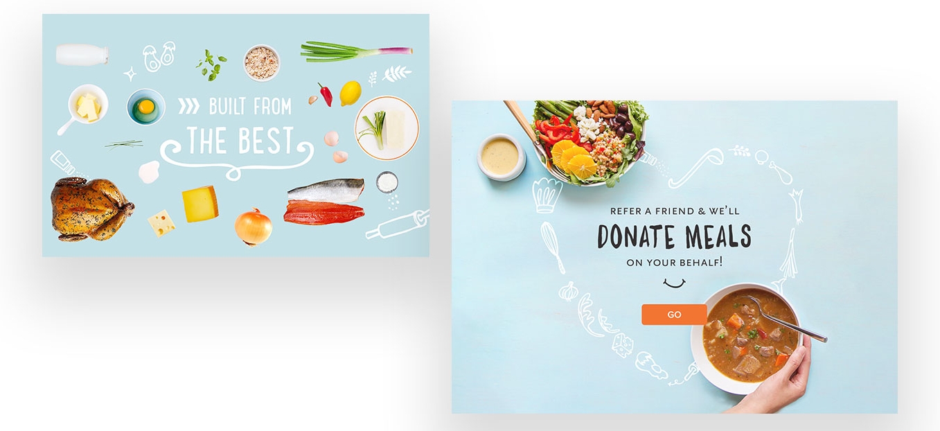
The design on external and internal pages was not well brand, and it didn't show off EAT Club's products—food. The photography, use of color, typography, all need to be cleaned up and make the beauty of food be the primary focus when people land on the pages.
SOLUTION
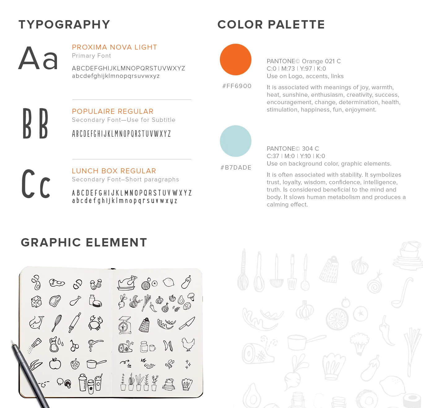
Enable to deliver the right company message with clean but playful design, we needed to clarify and fully understand EAT Club's brand identity and how to use from Typography, Color, Graphics Elements to Photography style. At EAT Club, we are all about food; we are friendly, caring and trustworthy. Therefore, using:
- Typography:
- Color: Decided how to use the two primary colors and the accent color. For example:
ORANGE—used on logo, accents, links.
BLUE—Used on larger areas, background colors, illustrations.
- Graphic elements: Used them in white, blah blah blah.
NEW EXTERNAL PAGES


NEW MENU


MARKETING/PRINT MATERIAL
I drew all the icons.