Menu Weekly View
Problem:
Visually unappealing
There is not separation between week to week

Solution:
Categorize this week and next week
Clean design

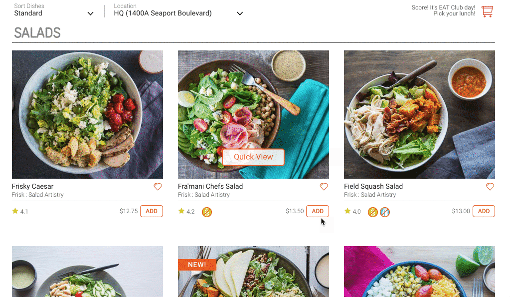
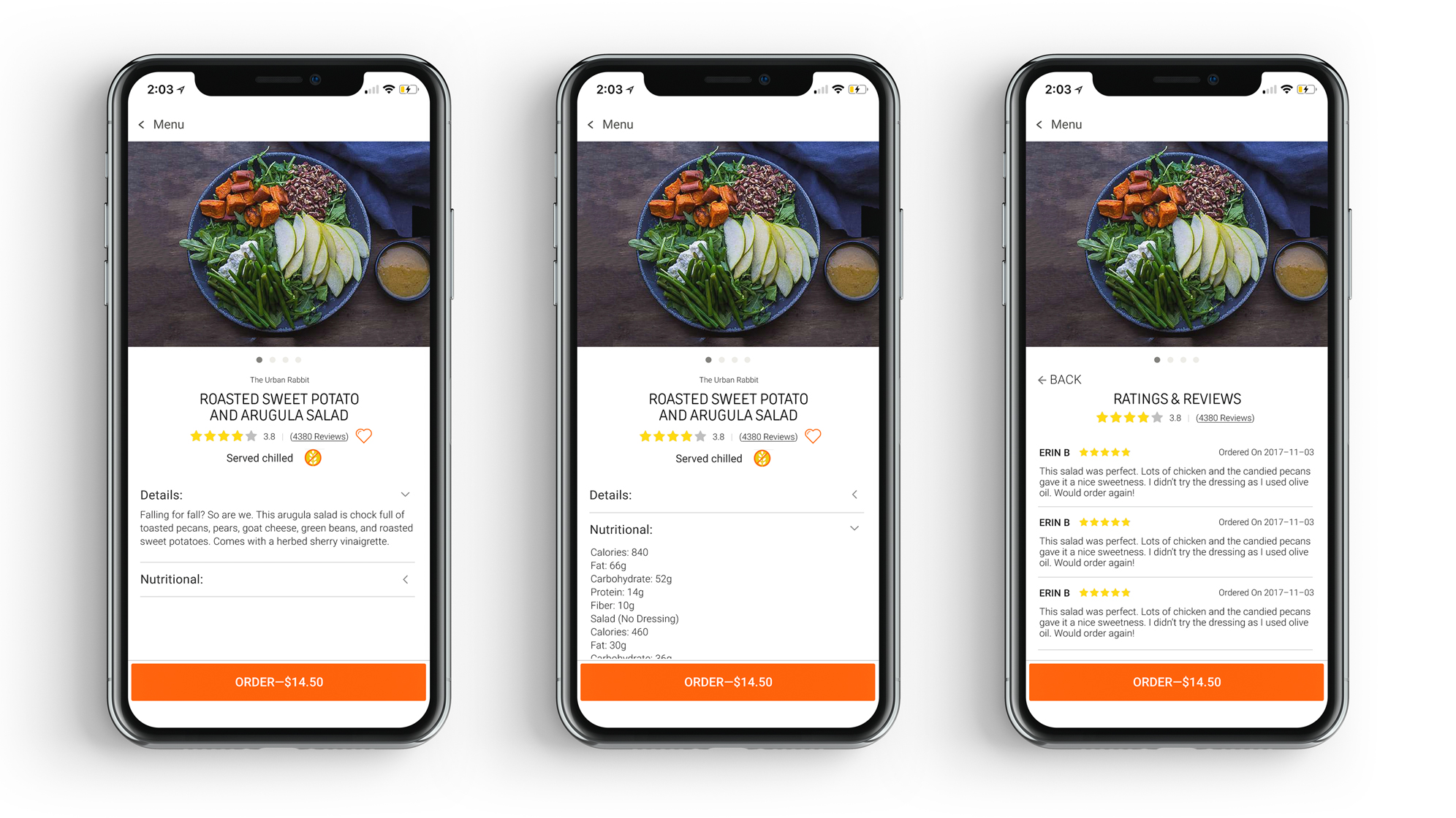
Quick View
Problem:
The image area could have more use
It's a waste of vertical space for Dish Description & Nutritional Information section
Reviews section isn't visually appealing
Solution:
Moving the dish image to the left, also adding photo gallery for users to see more details of the food. (Video too)
Stack Up the information categories
Clean up the design
Add Extra
Goal:
Sometimes, EAT Club would like to promote add-on items (limited time only) for admins to order in the Admin dashboard.
In this case, EAT Club wants to promote pie for 3.14 "pie day"
What I did is create a banner that will have a drop down on click and people will be able to see the information about the promotion and complete their order the same place.
When the admin has already ordered the pies, it'll also show the order summary on top.
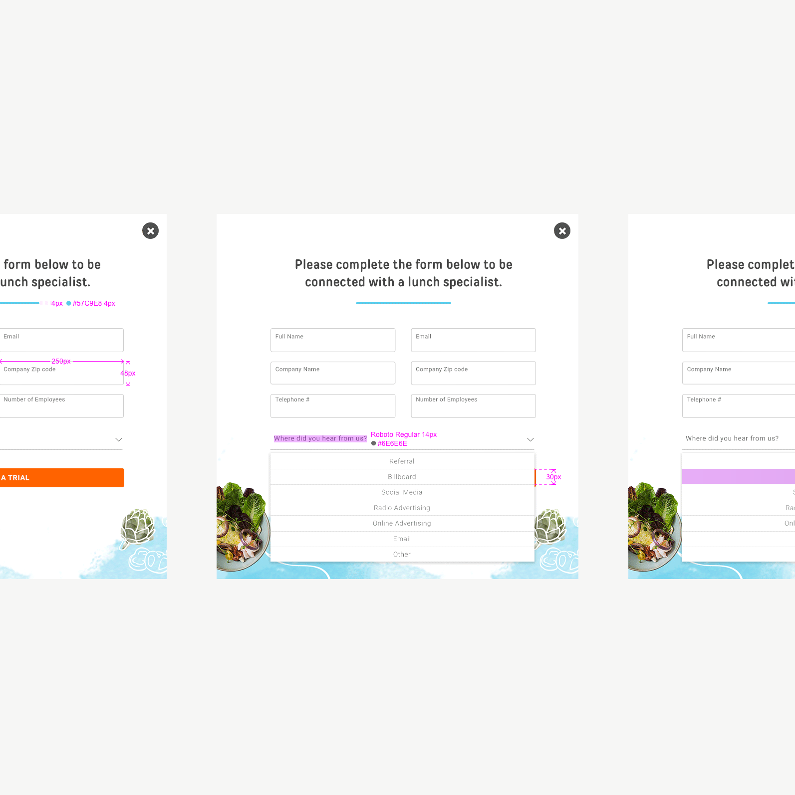
Open Form
Goal:
Sales team want to put an open form on top of the video on the homepage to test the performance.
What I did is to keep the form as clean as possible as the background video is already a lot.
So, the form is folded until users click on the field ready to put the information.

Confirm Deliver Address
Problem:
Some companies have multiple offices in different locations. Users sometimes forget to check the location and make the order deliver to the wrong address.
Solution:
Before user clicks on the "Add" button, it'll show the address that this meal is going to deliver to.